Wednesday, December 21, 2016

Christmas Card Painting Versus the Actual Christmas Card


The Rectangular front panel of the completed Christmas Card


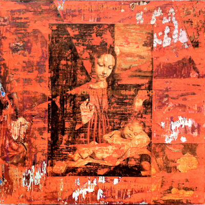
The Square Mixed Media Distressed Painting

Well over a month ago I wrote abut the completed Christmas Card Painting. At that time I also promised that I would publish a comparison of the painting with the card when it was finished. By now those who were to receive a card in the real world have, so I’m playing catch-up on the art blog.

Comparing the visuals above one can see how different they are in composition. First, the changes were necessary as I went from a square format to a rectangular one. I had planned on the card being rectangular because the standard size for postal use is 5” x 7.” That is why the central image of the Madonna and Child (Virgin of the Veil (1500) Borgognone) is a rectangular format that shrinks in size as each set of layers in the painting is completed. Second, the accidental process of layers of images and paint added and removed over time creates its own compositional argument, and I wasn’t completely satisfied with the composition of the finished painting. I spent a great deal of time playing with placement and size of various elements using Adobe Photoshop. So, the final card is very different in composition from the square format of the original for both these reasons.

Saturday, December 3, 2016

Prototype Landscape Finally Finished


I walked into the studio yesterday with the idea that I would alternate work between the experimental landscape and Christmas cards. First, I cut and pasted inserts into 8 cards. Then I filled my water tub, prepared the palette and stepped up to the canvas thinking, “h-m-m-m-m-m, I could add a wash of green on these spots in the lower left corner, and I might put a dab of opaque white paint here in the middle of the canvas, and I could extend this curved line across the central canvas to the upper left.” But then, I thought, “is all that necessary?” I answered myself with a great big “NO!” Instead, I thought, “It’s finished!”

Tuesday, November 8, 2016

Experimental Abstract Landscape Almost Finished


Landscape, third stage

It must be a testament to how busy my life is. I forgot to post these images on my journal though I had put them up on Facebook. Not to complain, busy is good!


Landscape, forth stage

I’m giving away a secret. Technology has helped in this process tremendously (bigly). If I had decided to work this way before digital photography and modern laptop computers were invented, say 1979, I would have had to purposefully set my 35 mm camera lens to be totally out of focus, shot a roll of film, taken that film to the drugstore, waited a week for the photos to come back before I could sort through them, and then the images still might not have had the color and abstract quality I would have been looking for. Instead, today I am able to shoot in focus photos with my digital camera, load the images into my trusty laptop, and manipulate them in Adobe Photoshop in a number of combined pemutations until I obtain something approaching the images I see in my mind’s eye.

I am satisfied with the way the painting is working. I need to deepen some areas in the shadows with more layers of transparent color, and at the very last I will need to add some off white, to white opaque paint patches to indicate the sparkle of sunlight shinning off of and through foliage. I may adjust the major zigzagging horizontal / oblique division of space here and there just so it is more definitely 1/3 to 2/3.

Wednesday, October 12, 2016

New Abstract Landscape Painting

Here are the first few steps in the first week of work on a new landscape painting. I’ve worked with only 4 mixed acrylic colors, a dark but transparent violet, a deep but transparent crimson red, a transparent tint of cobalt blue, and a deep but transparent emerald green. All of these colors have been painted into a very wet surface, and often I used a wet brush to go over edges of painted areas.


I must emphasize that this painting is experimental. It is very different from any artwork I’ve made in the past. I have made landscapes but none that weren’t based in realism. While I have worked with many different techniques over the years, oils - graphite and pencils, watercolor, acrylics, mixed media distressed painting, graphics and computer graphics – these have always contained realistic images even when abstracting and/or also containing nonobjective passages. Instead, this painting is to be made up completely of abstracted washes and opaque passages of acrylic paint.


If this landscape works the way I want it to, I will create a new body of work based on it. If it does not, I will not pursue the technique any further. I’m hoping that upon completion - in addition to the obvious color transparencies and abstracted nature of the work - there will be an abstruse spiritual quality that projects to most viewers. There will only be one way to find out if that is so. I will have to make a questionnaire and poll viewers.

Sunday, October 2, 2016

Finished Mixed Media Distressed Christmas Card Painting


The 10” x 10” mixed media distressed painting has gone through 6 stages with about 6 layers in each. While not completely satisfied with the painting, I’m done. However, this is not the final image for the Christmas Card. In order to make the 5 x 7 image I will have to crop out some of the various components in the painting. That will necessitate making copies of the various components so they can be pasted back into the 5 x 7 inch image using photo shop. That will not be as easy as it sounds. I will have to move things around, and possibly change the size and attitude of some elements until the entire composition comes together. I will make a comparison of the mixed media distressed painting and the card image on this blog when the card is ready to go to the printer so the viewer can see the differences between the two.

Thursday, September 22, 2016

Harrison Ford Portrait Finished and Installed September 18, 2016


The 3 x 4 foot painting looks small next to the larger portrait of Leonardo DiCaprio. In the second image above changes in style and technique are also readily apparent; 1) the image is more fluid without damaging the likeness, 2) the fluidity is a result of the purposeful curvilinear shapes, 3) and the blended opaque and transparent passages. These last two techniques are different from the patchy chunks of opaque color used in the past though I continued to use that technique in this portrait as well.

I’m sad to say that Windows On Queen, our Goddaughter’s banquet facility at Character’s Restaurant in Lancaster, PA now has its complete compliment of character portraits. So, if I continue making these I shall have to find another venue for display. At the same time, I would like to move on to another body of more abstract work based in landscape. Perhaps I can continue to do both as well as doing more mixed media distressed paintings for the LGBTQ Pictionary. Good grief! I need to clone myself in order to do all this simultaneously!

Monday, September 5, 2016

Harrison Ford Portrait – One Week To Go


The details are a (BLEEP)! As I wrote in earlier posts, I’m working with a more complex technique on this portrait. Instead of working with all hard-edged patches of color I’m working with transparencies in some areas, and blending opaque areas in others, with both these techniques set against the hard-edged patches of color. Because of that I spent 3 hours on Harrison’s left eye yesterday, a small area of several square inches. In the flat opaque areas I am having to do two coats because the acrylic is drying transparent. So, I guess it is time to change brands of paint, or look for one that is labeled, "thick and opaque." Most acrylic paint colors should be opaque until thinned with medium and water to be transparent.* So, I am having to paint with the smallest of brushes in order to keep small details even and crisp, making sure the second coat is perfectly aligned with the first. Never the less I am extremely pleased with the painting, and I should be finished the week after my 72nd birthday.

Notes

* exceptions are magenta and pthalocyanine blue and green.

Monday, August 22, 2016

Ten Days Progress on the Harrison Ford Portrait


I am working hard-edged opaque passages of paint against soft edged blended opaque passages both of which are interspersed with transparent passages. Interestingly, there are sections of hard-edged passages in which I'm creating the appearance of transparencies. All of that marks a departure from the way I've worked on these over sized iconic portraits in the past. Because of this complex technique the work is slow, but I'm enjoying it tremendously.

Thursday, August 11, 2016

Over Sized Harrison Ford Portrait For Characters Restaurant


Finally, we’ve landed in Rehoboth Beach longer than a week, and I’ve had time to work. I’ve played with Adobe Photoshop - inverted, colorized, reversed, polarized, cropped, tilted, turned, stylized, cropped, painted, transformed and combined the many images I found of Harrison Ford. The final manqué has been put on a grid and printed out in sections. I also made a grid on the 3 x 4 ft canvas and finished transferring the smaller image onto the larger canvas with pencil. I’ve mixed many of the main colors, and I’ve begun painting. I am also experimenting with a different technique for this portrait. All the other over sized portraits at Windows on Queen were done with distinct hard-edged patches of color. This time I will mix passages of blended color with the usual hard-edged color, and I hope I can make the two of these work together stylistically.

Thursday, June 9, 2016

Sixth State: Five More Layers on This Years Distressed Painting Mixed Media Christmas Card


I continue to write about the many steps involved in creating our 2016 Christmas Card. It is a process that I return to over time as I also work on other art projects.

Just five layers to go and the painting will be done! However, I’ve several other projects in progress so will not return to the card until August. It should be done toward the end of that month.  The final steps will include; 1) decide which portion of the painting will be photographed for the actual card, 2) Photograph and crop the image, 3)  the card design (inside and outside) created and sent off to the printer.  Unlike my usual mad rush to finish, this card should be done well before mailing time for the holidays.

Friday, May 13, 2016

2016 Christmas Card: 5th State

I continue to write about the many steps involved in creating our 2016 Christmas Card. It is a process that I return to over time as I also work on other art projects.


After I scraped through the blue layer of tempera it was necessary to spray the artwork with several light coats of pastel fixative so that a coat of water based UV proof varnish could be applied without lifting the tempera paint. Once that layer was dry I made a 10 by 10 inch print of the digital photo I had taken of the mixed media distressed painting in its 3rd state. I tore that print in pieces and laminated some of those over top of the artwork.* Another coat of UV proof varnish was applied, and once that had dried I took photographs again.

I have at least 9 more layers to do before I can call the painting finished, so please stay tuned for the 6th  and 7th state of our 2016 Christmas Card.

*laminate – to glue two flat surfaces together using a continuous layer of adhesive

Friday, May 6, 2016

2016 Christmas Card: 4th State


Doing the following created the 4th state:

1. spray the painting with several light coats of pastel fixative
2. a coat of water based varnish was brushed over the latest layer of tempera paint
3. cover the painting heavily with oil crayon and rub it with an eraser
4. apply a new coat of light pthalo-blue tempera paint
5. scrape through the new layer of tempera paint after it was dry.

Stay tuned for the 5th state of our new Christmas Card

Monday, April 25, 2016

2016 Christmas Card: Third State


After 4 more layers the painting is now dominated by red-violet lavender instead of orange, though that is still prominent. The four layers are the following; 1) ultraviolet light resistant varnish, 2) laminated images, 3) wax, 4) lavender paint. After those 4 layers I subjected the paint to scraping, with various instruments, and finally sprayed lightly with fixative.* I have laminated a smaller image of the Madonna and Child by Ambrogio Bergognone (known as Borgognone) over the first, as I shall do again for the Forth State in an attempt to telescope that image. I don't know if that technique will work because the mixed media distressed process may cover all but the final image completely. But, then again, it may not. That is what makes working with this technique so much fun. It creates its own mystery and history. It is like an archeological dig of an ancient historical sight in reverse, each layer of detritus reveals and/or obscures various epochs. However, instead of cutting back through the ground, I'm building it one layer at a time.

notes

*Laminate - to fasten two flat surfaces together with a continuous layer of mastic or glue.
  fixative - varnish, usually aerosolized.

Tuesday, April 19, 2016

2016 Christmas Card: 2nd State


I promised to post the artwork as it progresses. Here is the panel with 4 more layers. It is now predominantly orange, but that will change. I know I want to telescope the Madonna and Child by Ambrogio Bergognone (known as Borgognone) so that the final image appears to be moving forward, however slightly that might be. Because the larger images will be buried in layers of paint, my desires for the painting may be lost in the process. As we must relinquish complete control over our lives more often than we would wish, so the mixed media distressed painting process mimics life.

The next time I post an image of the artwork it will include the following; 1) this digital photo will have been printed at the exact size of the painting/collage, 2) it will have been torn to pieces randomly, and some of these will have been laminated back into the painting either before or after l include a smaller image of the Bergognone, 3) Then the whole will possibly be covered in a shade of muted green, though I’m not sure about that color yet.* I haven’t thought beyond that state, and will not until the actual physical object has caught up to my imaginings. Ah, the mystery of it all is so much fun!

Note

* laminate - in collage/montage, a layer of glue is spread on the artwork itself and another on the back of the torn/cut paper to be glued in place. the new piece is carefully smoothed into place, rubbing from the center to the edges in order to remove trapped air.

Tuesday, April 12, 2016

"Harmony" Art Card Is In Process

I’ve been working on the next art card, “harmony.” At first I used colors that looked more like “Blitzkrieg!” So I moved on to cooler colors blues and greens. I still wasn’t happy, so I toned the colors and movement down more. The wavy lines are meant to represent tones. I doubled lengths so that the tones represented might be harmonious. However, it was necessary to keep all at low amplitude (no big zigzagging up and down curves) so as to keep everything harmonious visually. In the third image I added type, and the word "harmony" using 72 pt. bold Century Gothic font.


"Blitzkrieg Harmony"

“I – Yah-e – Yah-e -eye!” The active voice begins to sound so egotistical! But, to write from a passive perspective is too weak, so I’ll stop being a literary critic and keep on with the analysis of the process involved in problem solving the representation of “harmony.”


"Toned Down Harmony"

I like to hide things in the art card images, as I also do in mixed media distressed painting. So various definitions of the word harmony are layered into the artwork and the words fade in and out of colors and the wavy lines.


The best "Harmony" so far

It will be necessary to have two sides to the card, and I’ve only begun to think about a second side. However, I’m not sure I’ve found the right image for the first side. Perhaps I’ll move on to the second side and my concerns about the first will have been resolved subconsciously when I return to the first.

Thursday, March 31, 2016

Mixed Media Distressed Painting In Process


This year’s Christmas card - yes, it is the end of March 2016. So, why am I working on a Christmas card now? Because I’m doing a mixed media distressed painting that involves perhaps as many as 50 or 60 layers before it is finished, and I can sandwich these layered steps between working on other art works including other mixed media distressed paintings. The process involves two different kinds of paint, glue, polyurethane, digital photography, Adobe Photoshop, oil crayon, and collage and dechirage, all mixed up together in a concoction that is sort of like a complicated soup. It is a process that I enjoy doing tremendously.*

At this stage I have 10 layers in the painting, and I like the dominant color, and the images that peak through the distressed layers of paint. However, it looks nothing like the final painting because this stage will be hidden beneath 40 to 50 more layers. That is part of what makes the process so much fun. Images appear, disappear and reappear entirely or in bits and pieces creating a sense of mystery and history, at least for me, the artist. I am depending on the acuity of viewers to pick up on that sense of mystery and/or history, and I know that may not always happen.

Never the less, the process is what makes mixed media distressed painting so enjoyable. I will continue to post photos of the painting at various stages of development up to the final image for the card, which will be posted as a Christmas greeting at the end of the year.

Notes

*Déchirage -I include here a link to Wikipedia entry on decollage which includes a definition of déchirage.

Saturday, March 5, 2016

Harrison Ford for Characters Pub


It’s over a month since I’ve added a post to my Art Blog!!!

Finally I have an image of Harrison ford (manqué) ready to enlarge for a 3 by 4 foot painting, the last in the series for our Goddaughter’s restaurant in Lancaster, PA.* However, this is one of two images. The other is of Will Smith. Our Goddaughter will decide which she wants for her restaurant.

I will send the two images among others I have worked on. But I’m happiest with this Harrison Ford image because I think it is a departure from what I’ve been doing with the images for Windows on Queen, the banquet facility at Characters.

This will be the last of the over-sized portraits for Characters.

* manqué - Artist's model. Sculptors have used the term traditionally when making a small model before creating a larger work. I've appropriated the word for my small sketches and Photoshop experiments made in preparation for larger 2-dimensional paintings.

Tuesday, February 2, 2016

Pastel Wave Painting #3

In January I decided to make a new 32" by 40" pastel wave painting. So this week I searched through my photo morgue to find candidates for the painting. *


New Wave Photo #1

I searched through several hundred photographs taken over the past 10 years. I have at least two thousand more, though I won't search through them all. I can use them for future wave paintings, and I will also shoot more photos of waves during the next several months.


New Wave Photo #2

I’m showing two of my choices here including one set of photos that zoom in closer and closer to isolate a small portion of the breaking wave. Now I just have to make a decision as to which photo I will use.

Wave #2, close up #1

The viewer could help by voting here or on Facebook for the photo of his/her choice.


Wave #2, close up #2

I will provide a hint as to my thoughts on the matter - the closer, the better!

Note

* A "morgue" is an artists file of photographs to be used as aids in drawing and painting. My morgue is made up of all photographs I have taken myself.

Thursday, January 21, 2016

Pastel Paintings of Waves


Wave #1

I conceived the wave paintings as an experiment in photo realism with one caveat. I wanted my process (the way I use the pastels) to be visible.


Wave #2

The first two wave paintings were done in 2012 and 13. It’s time I got back to that series. I have taken hundreds, perhaps more than a thousand photos of breaking waves over the years. I will begin the search through my morgue for new photos to work from this weekend. * The two paintings shown here are 30 by 40 inches and 32 by 40 inches respectively. I cropped the original photos, looking for a small section that was in perfect focus in order to freeze the water’s motion completely. These were then copied meticulously, but still using my direct application technique with the pastels rather than rubbing, blending and smearing as most pastel artists do. *1 Because of that technique, the paintings appear to be photographic upon first examination, but break down into individual chunks and strokes of color upon the viewer’s closer approach. I use the pastels themselves to blend one color into another. That makes the color lie on the paper surface allowing the white paper to show through rather than turning the white paper itself into a darker color.


Notes

* Morgue – a visual artist’s file of photographs used as an aid to drawing, painting and/or sculpting.

*1 Experts have told me that I use a contrary and actually improper technique. Too bad! I achieve a depth and intensity of color that it is impossible to achieve by rubbing, smearing and blending, the traditional pastel technique. That is why I call my large pastels, paintings!

Monday, January 11, 2016

A Blast From the Past


Isaac At Rehoboth Beach (circa 1957)

The journal entry is for November 22nd 2005. The entry is one of several written by “the professor,” in Isaac’s Family Photo Album, and was part of several alternate realities I created to illustrate psychological, sociological, and philosophical aspects of my doctoral dissertation (Isaac Stozfuts: Images About Male Sexuality and Culture). After completing the doctoral degree in 2000, I extended and elaborated these aspects in the virtual reality that is the Internet. I have since removed most though an abbreviated version of the photo album and a good portion of Isaac’s journal still exist out there in the “cybervoid.”* If anyone is interested the title page of my own journal, “The Art of John Bittinger Klomp” includes the links to “Isaac Stolzfuts’ Journal” and “Isaac’s Family Photo Album.”

* cybervoid – a term I invented in 1998 to describe the vast space - seemingly infinite and often vacuous though filled with information - that is the Internet.

Monday, January 4, 2016

Beach Walk


This is an updated version of an older pastel painting (2010). The newer work (February 2015) has additions that contribute to my (the artist’s) and hopefully to the viewer’s awareness of the natural theater present at water’s edge. I made it for the Gay Men’s Chorus of South Florida art auction to be held this month.

The young man walks by the light foamy aqua to deepest dark blue ocean waves that gently flow onto the brown sand with shells scattered on a low tide beach. Above his head pelicans fly, a full moon floats low and hazy in the daytime sky, and a sailboat cruises slowly in the sea breeze near the horizon. It is one of those perfect days, the wet sea sand glazed and reflecting a blue-mirror at waters edge, lambent zephyrs tugging at his hair and gently wafting cross sun warmed skin. He pushes grains of sand into small aqueous dents that disappear as he drifts through the picture plain, the sand grains scouring flakes of skin from the soles of his feet.

Never the less, he is unaware, cloaked in his virtual aural iPod reality. How easily he accepts the temple of sea and sky, not aware of God’s presence within or in the actual world that surrounds him.