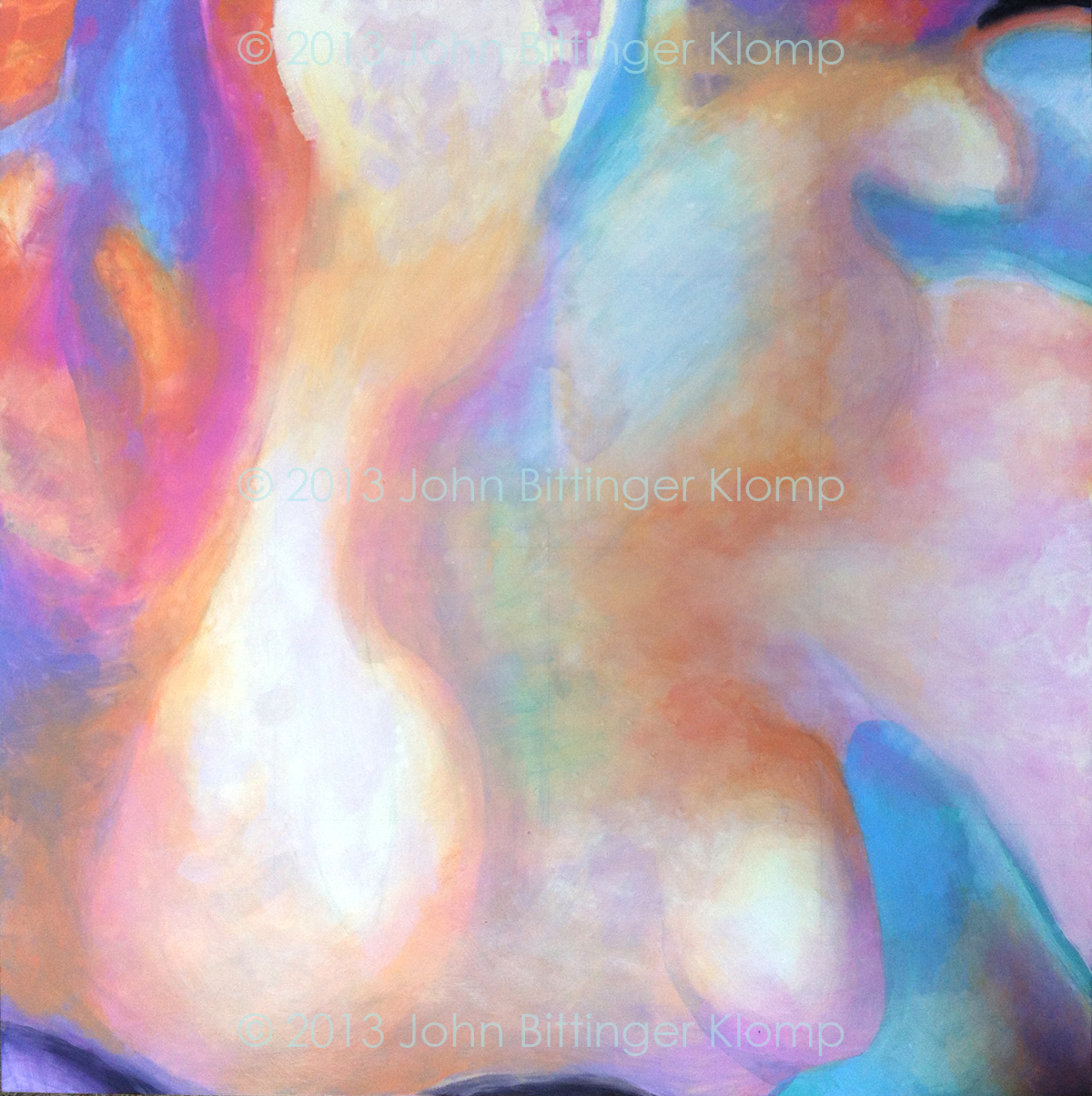
Wednesday, September 25, 2013

Leonardo DeCaprio As Gatsby: Part VIII

Another in the series of blog entries in which I describe the process I am using to create an oversized portrait.

Square C1R3


Square C1R3, the lower right side of Gatsby’s mouth and face, actually the left side since I reversed DiCaprio’s head in Photoshop. This entire side of the head (Painting right/viewer left)is more detailed than the other side, though in order to make the two sides of the painting work together, I have begun to work a bit more detail into the other. Also I am working some of the green and blue from the viewer's right side into the left side. Additionally, looking at the thumbnail images on my desktop I realize that I must lighten an area to the left of the mouth in order to emphasize the lift of flesh in Gatsby’s smile.

One viewer made the comment, “It's amazing how much color goes into the painting of a face!” * I hadn’t really thought about the color since I made the color changes in the original small sketch on Photoshop. The changes were based on the fact that beneath the surface color of human flesh there is a variously colored blue-green and green layer. It is especially helpful to expose that layer more completely in the shadowed areas of the portrait one is creating in order to make the contours of the face recede. The masters knew this and often painted such a layer before painting the flesh colors over and/ or interspersing layers of blue and green within the layers of more natural color. It took the Impressionists and the Post Impressionists to expose this trick and paint intense blue and green passages of paint on the surface of the “fleshscape.” *2 It is interesting to note that I ended up with most of the blue and green on the left (sinister) side of DiCaprio’s visage, though (due to my reversal of his image) it is actually his right side.

Over all, I’m happy with this square (C1R3), and I think the changes I make in the future will be minimal, just the one noted above, and those necessary to make color passages line up exactly across the panel borders.


Notes

*Grant, Betsy, in Leonardo DiCaprio As Gatsby: Part VII, http://jbkart.blogspot.com/2013/09/leonard-decaprio-as-gatsby-part-vii.html. Posted 11:09 AM EDT, Friday, 09/21/13, viewed 10:21 AM EDT, Wednesday, September 25, 2013.

*2 Fleshscape is a word of my own making. I’m sure others have done so before me.

Wednesday, September 18, 2013

Leonard DeCaprio as Gatsby: Part VII

Another in a series of blog entries in which I discuss the process I am using to create an oversized portrait.  

C2R2 finished


I should say it is almost finished. This square is the fourth square I worked on from the 5’ x 7 & ½ foot painting of Gatsby.I will post two images of C2R2. The first was taken on September 16th, and the second yesterday. Note the changes. The changes are subtle, mostly in the hue and value of colors.


These are due to looking at this square in relation to the surrounding squares above and to the left. I haven’t been able to compare it to C2R3 yet because that square isn’t far enough along to make the comparison.
1. Most of the hues have been adjusted to be greener and/or more orange.

2. The color transitions have been made smoother.

3. I had to change alignment around the edges so that the panel would line-up with the surrounding panels.

Wednesday, September 11, 2013

Leonardo DeCaprio as Gatsby: Part VI

Another in a series of blog entries in which I discuss the process I am using to create an oversized portrait.


This is the third square of six, column 2, row a. By looking at and discussing the progress of “Gatsby” I am learning what I must do to finish each section. For instance, immediately upon looking at the chart above, I see that I need to make the orange in DeCaprio’s forehead deeper, that is I must mix a color that has more of the orange hue plus a bit of the complementary color (blue) to dull it down.*

I am actually working 2 squares ahead of this one, but as I have written in the past, it is constantly necessary to check back to all the squares to make sure that each is working with the others, that colors and brush work agree across the artificial divisions of the picture plane. One of the most disconcerting aspects of working in these sections has been that the left side of the portrait is more detailed and more realistic than the right side of the portrait. When viewed as one the two sides work together. However when I am working on the individual sections this aspect of the portrait has proved to be terribly disconcerting. Viewed as separate abstract artworks, the brushing and color is so different as to make the three squares of column 2 appear to be entirely different from the three sharper and more heavily painted squares of column 1. I constantly have to reassure myself by returning to my original sketch in order to see that, “indeed the 2 columns do perform as one unit, not two separate pieces. Unfortunately, the necessity of dividing the portrait into these 6 separate parts because of the lack of studio space, and in order to ship the finished painting 140 miles has generated these difficulties. In other words the solution to these two problems has generated another – fortunately not insurmountable – problem.

* For the definition of "hue" and "complementary color," folow the links by clicking on the words.

Friday, September 6, 2013

Sundance Auction 2013

We interrupt this blog to present a few pictures of Sundance Auction 2013

This was the best auction We've been involved in. Murray Archibald’s circus theme was spectacular! It is my understanding that we made $10,000.00 more than last year, all to benefit Camp Rehoboth and AIDS Delaware.