Monday, January 30, 2012

By the Sea

*
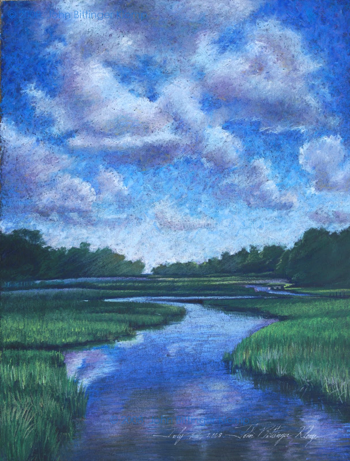
"By the Sea," mixed media and distressed paint (30” x 30”) January 28, 2012

By the sea, Mr. Todd, that's the life I'll covet,
By the sea, Mr. Todd, ooh, I know you'd love it!
You and me, Mr. T, we could be alone
In a house that we'd almost own,
Down by the sea!*1

Mixed media distressed Painting is a technique that demonstrates a history in each and every artwork because of the many layers of paint that hide, obfuscate and disclose laminated items and text.*2 The blurred history in this particular painting demonstrates the possibility of parallel historical outcomes. In one we have the sense to keep our clean water and save all life on this planet. In the other we destroy our clean water, and all life on earth. At the same time I have always been in love with bright colors, the colors of life. That infatuation with intense color imbues this painting with optimism not always felt. On the surface, this is a confident work that displays the success I feel in my own life and work. However, lurking immediately below that facade is the not so well hidden presbyopic vision of human recklessness.


Notes

* Upon seeing the painting in the blog, I’ve decided it isn’t quite done. I’ve got to do some damage to that boat in the middle. ☺

*1 Sweeny Todd The Musical, Lyrics (1979) http://broadwaymusicalhome.com/shows/sweeneytodd.htm

*2 There is no link in Google for distressed painting in fine art. I very much doubt that I am the only person on earth using the technique in the creation of fine art. Never the less, all the links I found were for commercial processes, and/or craft products and techniques.

Wednesday, January 25, 2012

Fifteen Minutes


Katherine (Woman of the Year), Powdered Graphite on paper, 32" x 40" (1980) On loan from a private collection.

I met Andy Warhol at the reception for his show at the Philadelphia College of Art back in the dark ages.* During his brief conversation with several of us students I remember thinking, “he’s a space cadet.” Of course, it was an act and we ate it up as though it were pabulum for babies. Years later Andy would make the now ubiquitous statement that “everyone will be famous for 15 minutes,” and, during the late 1970’s to early 80’s I had mine. The brief span of success on a large scale was based on the creation of a series of Photorealist graphite portraits of iconic personalities. Many were motion picture stars like Katherine Hepburn, Christopher Reeves, and Marlin Brando. Others were various music, literary and historical figures like Leopold Stokowski, Jack Kerouac, Robert Oppenheimer, and Abraham Lincoln.*2 I started these drawings in the mid 1970’s by making marks with pencils on paper. Over time I discovered a plethora of techniques that allowed me to gradually move away from using the pencil alone. Instead, I began to grind the graphite into powder and applied it to archival paper using paper stumps, various kinds of cloth, and a variety of erasers. I also learned to use erasers to make marks of their own in the fields of layered graphite by removing and/or smearing some of the graphite from the surface. *3

I had a show of these drawings at The Walnuts Gallery, Philadelphia in 1979. After that show I camped out in telephone booths in New York City with my 3 x 5 card file and called hundreds of galleries with my little questionnaire, asking first, “are you interested in new and unknown artists?” I practically lived in one booth at the Hotel Carlyle, the concierge making change for me as I continued through the card file, X’ing out gallery after gallery. A close friend gave me the nick name "Clark Klomp."*4 However, after a long summer of telephoning and visiting galleries in person, I found a gallery that was willing to look at my portfolio. The owners of Good Company Gallery at 69th and Columbus loved the drawings and for several years the drawings hung in the gallery and sold on a regular basis to motion picture and theater personalities, writers, and entrepreneurs.

The story of how those 15 minutes came to an end in 1983 isn’t important. They were over, and I stopped making the iconic personality graphite drawings. I have since done a few graphite portraits on commission, and I still love to work with the powdered graphite technique. This past year our Goddaughter, a world-class chef, bought a restaurant in Lancaster Pennsylvania named Characters. She asked if she could use the drawings of motion picture stars. So, once again the remaining drawings have been resurrected from their plastic wrap and cardboard box tombs to hang in the light of day.*5


Notes

* The Philadelphia College of Art has become the University of the Arts after a merger with the Philadelphia School of Performing Arts.

*2 Many master artists had been and were working in a Photoreal, later Superreal/Hyperreal style at the time, and they include Chuck Close, Ralph Goings, Richard Estes, Audrey Flack, and others.

*3 Additive and Subtractive techniques with powdered graphite were pioneered by the French during the mid nineteenth century then largely forgotten.

*4 The "mild mannered" Clark Kent character in Superman comics and TV shows (1952-58) ran into telephone booths to shed his bland reporter persona and become the super hero.

*5 see entry this journal, “Marilyn Monroe Sighting at Character’s Pub, Lancaster, Pennsylvania.

Friday, January 20, 2012

Rehoboth Beach Waves, August 21, 2010


Rehoboth Beach Waves, August 21, 2010 (Digital Photomontage) printed version (16" x 20")

As part of my interest in clean, safe water, I’ve done a series of wave progression photomontages at beaches in the Middle Atlantic, south Florida, and Mexico. The color of beach sand has so much to do with the way the waves photograph, and the depth of the water as the waves flow in and out changes the color of the water subtly from image to image. Also, the color of the water varies from beach to beach, and day to day in each location. In this particular composite photograph, taken from 1:00 P.M. to 1:15 P.M. on August 21, 2010, the sun is very high overhead, and so a hot spot exists on most of the photos with the exception of those with rougher and deeper water. In the top row, middle photo, and in the third row, 5th photo from the left, you can see waves crossing the sun’s image and erasing it.

The repetitive motion of wave after wave, flowing in and out in all the photomontages suggest continuity, but also change within the continuity. Each wave is a variation on the theme of “Water Equals Life,” the title of the last journal entry. Destroy the water, and you destroy all life on Earth is a not so subtle undercurrent that flows through all my artwork these days, even the pretty pastel paintings.

Sunday, January 15, 2012

Water Equals Life


Water = Life, (8"x 8") mixed media distressed painting, 2011

Water equals life should be a self-explanatory statement of fact because without water there would be no life. However, along with all the other realities we ignore, this one is perhaps the most frightening. I see people in south Florida throw their plastic junk on the beach constantly. On our beach the trashcan is a short walk away. On Delaware beaches people are more conscientious for some reason. Could it be that they are more mannerly in general? Or are they actually more aware of the consequences of their recklessness? It is essential that people everywhere be made aware that their profligacy will damage the future of our planet.

"Why is that, John," my alter ego says.

Plastic bottles begin to decompose in ocean water at temperatures of 86 degrees Fahrenheit much more rapidly than previously thought. They leave behind poisonous derivatives of polystyrene suspended in the salt water. Plastic bottles and bags are found floating in the oceans all over the planet because hundreds of thousands find their way through our run-off into streams, then rivers, and finally into the ocean every year. Additionally, plastic bags especially will kill turtles and porpoises because they are mistaken for food as they float in the water.

Plastics are oil-based products. We already know what oil will do in salt water from watching the 2010 BP Gulf Oil Spill Disaster unfold. Gulf Coast states are still reeling in 2012 from that horror despite BP television commercials to the contrary.

All of my distressed and pastel paintings are aimed at awareness and conservation of the oceans of our planet. Now, I must somehow find a way to put them before the public, though few seem to be interested in art that has a purpose other than being pretty. Never the less, I know that these paintings are handsome artworks and artworks with a purpose.

Tuesday, January 10, 2012

Koi Pond #2


Pastel Painting (30" x 44") December 9, 2009

One friend said she wanted to buy this painting, but that was 2 years ago. Other than that there has been no interest. I've looked on line, and Koi paintings seem to be a dime a dozen, so I haven't done any more of them - partially because work this large can take as long as one month to complete. However, I'm very happy with the way the reflections of sky and land plants contrast with the view through the water and past the fish to the bottom of the pond. I also like the fact that I added the butterfly because it flies through the air as gracefully as the Koi swim through the water.

Thursday, January 5, 2012

John's New Year's Resolution


Holland Glade #1, (2008) Pastel Painting, 12” x 14”
[This particular painting has never been exhibited]

I’ve always had an aversion to self-aggrandizement, partially because I know my place in the universe, and partially because I don’t own my talents. Talents are God given, an accident of birth. As such, it is a terrible wrong not to develop and use them, but use should also be tempered by a bit of humility. So, in my journal/blog “The Art of John Bittinger Klomp” I hardly ever write about my art. Most often I do a monograph about architecture, someone else’s art, Art, the Art World or Art Theory as in Metamodernism v. the other “Ism’s.” In the past and present I’ve also written about politics and illustrated those journal entries with my own graphic art. However, due to processes beyond my control, I’ve discovered that I should write about MY ART more often. It is absolutely necessary that I put my work first, and by way of a New Year’s resolution – I will put my work FIRST!

If I don’t show my work, discuss my intent, processes, techniques, and ideas, who else will? In this current climate of economic distress, the contemporary Art World is bent upon the work of a few “masters,” past and present that it can make increasingly valuable through exhibition, press, and discussion in other institutional venue. That discussion often promotes the art of the past (immediate or historical), and/or “cutting-edge theory-based art” by younger artists that art institutions themselves promote and purchase. A secondary and older artist like myself, who has already had his two minutes of fame as a much younger person has no chance to become more established against such Institutionalized commodification aimed at a very rich conservative audience, and/or the Art institution itself.*1

Thus, in the future the reader will find more entries about MY ART, instead of so much theoretical musing about Art and other artist’s work. That is not to say that I won’t write about Art, Art Theory, as well as contemporary works of art – I can’t stop my over-loaded and cluttered mind from its rambling contemplations about art in general, and I will want to share those thoughts with others. Never the less, there will be more self-promotion flowing through this computer keyboard and out into the "cyber-void" in 2012."*2


Notes

*1 Unlike Andy Warhol's statement that "...everyone will have 15 minutes of fame," I may have had 2 minutes of almost fame in the late 1970's to early 1980's with the hyperreal graphite drawings of contemporary and historic iconic motion picture personalities. See journal entry this blog for Wednesday, September 21, 2011, titled "Marilyn Monroe Sighting at Characters Pub, Lancaster, Pennsylvania," http://jbkart.blogspot.com/2011/09/marilyn-monroe-sighting-at-characters.html.

*2 Cyber-void is a term coined by Isaac Stolzfuts in his Weblog (2003-5) at http://zacstolzfuts.blogspot.com/2003_12_01_archive.html. Viewed, 11:01 P.M., EST, Tuesday, January 3, 2012.