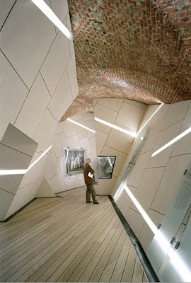
Danish Jewish Museum, interior
"The Danish Jewish Museum will become a destination which will reveal the deep tradition as well as the future of the unprecedented space of Mitzvah. The intertwining of the old structure of the vaulted brick space of the Royal Library and the unexpected connection to the unique exhibition space creates a dynamic dialogue between architecture of the past and of the future - the newness of the old and the agelessness of the new." *
Danish Jewish Museum, exterior
Limited by time and work, this will necessarily be brief, reductionist and to the point. It does not indicate any limitation to the importance of Daniel Libeskind as a late Twentieth and early Twenty-first Century architect.
Libeskind first came to my attention in 2003 when his design was chosen for the new World Trade Center in New York City. His design universe is based in distorted 3 and 4-sided polygons that look crystalline to this observer, and may be considered to some extent organic (or not). Often his work is collaborative - I question whether by choice - he never the less seems to welcome the limitations placed by interaction with others. So many of the designs also include an interaction of his contemporary design concepts with historical structure. Initially critics claimed his work to be too assertive, though his subsequent international success demonstrates approval of his bold designs. Libeskind was born in Poland of Jewish/Polish survivors of the Holocaust, and became a U. S. citizen in 1965.
This brief summary is indicative of a Metamodern position based in metaxis. However, the question remains, is the indication based on my own position?
Notes
• Libeskind, Daniel, The Danish Jewish Museum, Studio Daniel Libeskind, http://www.daniel-libeskind.com/. Construction completed September, 2003, opened June, 2004, Viewed 10:20 AM, EDT, Wednesday, July 20, 2011
• Libeskind, Daniel, The Danish Jewish Museum, Studio Daniel Libeskind, http://www.daniel-libeskind.com/. Viewed 10:20 AM, EDT, Wednesday, July 20, 2011. The one time use of images for intellectual purposes is thought to be within the legal limits of United States copyright law.


2 comments:
Libeskind's work seems to be driven by gimmicks rather than by thoughtful and sincere responses to the context or the design problem to hand. The crystaline forms and the random slashes have become a branding tool rather than an insightful gesture particular to the problem.
Libeskind's real skill has been marketing shallow and superficial formlism as though it were true architecture. The lack of depth in his work is what makes it so tiresome. Like a bad joke, it wears thin very quickly.
How is Libeskind's "shallow and superficial gimmickry" different from (say) Herzog and de Meuron's use of curvilinear forms , or stacked boxes, or Gerhy's convoluted curves and warped buildings? I could use some help here in recognizing how these things differ, or are all these architects using gimmicks?
Post a Comment