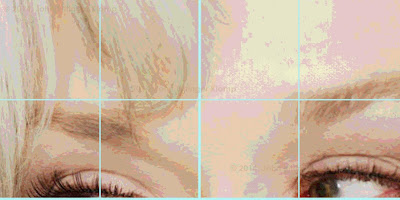
computer manqué
I wasn’t interested in matching the color in the painting to those I made in the small-computerized version. Instead, the colors are much more intense. And, in some cases the hue isn’t the same. At the same time all the areas of color do have to match exactly from one panel to the next, so perfect draftsmanship is a must. If there were errors in drawing, the edges of the panels would not match, and much worse, Meryl would not look like Meryl.
the 2 (30" x 30") painted panels
I am pleased with the boldness/power of these two panels. There is only one small area that could use some tweaking in the left panel, and that is the three brown lines to the right of center. They appear to be divorced from the surrounding paint. If I have time when all six panels are finished I’ll go back and play with that passage a bit. However, the deadline looms but one month away, and this little thing is probably one of those that only the artist knows about. There won’t be any viewer saying – “Darn, look at those three ugly brown lines in Meryl Streep’s hair!”
I’ve started panel 2a, and hope to finish it this week. We shall see as we have guests coming this weekend, which means I must be done by Friday.
My alter ego says, “good luck with that one, John! You’d better not do anything but paint!”
Note
* manqué - here I am referring to the “inferior” computer generated image I made to use as a guide in making the painting. It is of necessity inferior to the final painted version as it is so small compared to the 5 x 7 & 1/2 foot painting, and the color is flat and vastly inferior to the painterly quality of the fished artwork.


No comments:
Post a Comment