Tuesday, February 25, 2014

History of a Commission

In Reverse


First few Steps in completing the commission

Our good friends first came to me with the kernel of an idea last year, 2013. She was redecorating their bedroom, and wanted a multi-paneled painting above the bed, had seen many paintings from the LGBT Pictionary, liked the mixed media distressed paintings, and requested the panels to be created in that technique. I said, “Why not make it a triptych since that type of painting has a 500 year history going back through the Renaissance,” and they agreed.

I bought the panels, paints, various varnishes, oil pastels, sprays, archival computer printer inks and other tools needed to make the new artwork after discussing color with my new patrons.* The room is to be in various shades of green and rust, and we looked at two bedside lamps she had bought. Once back at home, I painted the ground layers on the panels knowing that those colors would almost vanish beneath the many layers to be painted over them. Finally I visited with a color-swatch sheet, though I made the point that I would be using more than the colors on the sample. After discussing the colors and making notes as to adjustments and additions I was struck with a notion. Why not bury images of family documents and photos from both sides going back through several generations. That would bring a family history into the room. Both loved the idea, and immediately began discussing which photos and historic documents to use.


Old Layered Distressed Walls

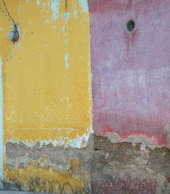
I don't know why it took so long for the inspiration of historic representation to occur to me because the technique lends itself to exactly that. In fact, the original idea came from looking at old layered and distressed walls in Mexico. These had posters and painted lettered signs buried between layers of various colors. The buried items were difficult to read, and without knowledge of local history I knew nothing of the actual events represented by the fractured items in the flaked and textured walls. Never the less they had an authenticity and presence that no ordinary flat-colored walls on ninety-nine percent of all the buildings I have seen possess. It felt as though I had held conversations with those walls.

At this stage in production the three panels have but one or two layers of paint on them. One has been distressed for the first time. Another is about to be distressed. And, the third has only the first layer of paint. Thus the panels represent the first three steps in the process. There will be many steps to come, and I thought to do a history of that process here on the blog. Ultimately, when finished this history will read backwards through time, with this first entry at the end, and the finished triptych at the beginning, a fitting reversal that will actually represent perfectly the mixed media distressed painting technique that I often work with.


Notes

* The reader (if there be such) can find descriptions of these art supplies with prices at Dick Blick Art Supplies.

Tuesday, February 18, 2014

February Graphics

I continue the monthly review of the past 6 years of graphics on this blog.


The February 3, 2008 blog entry began,
“I was going to write about the photographer F. Holland Day this morning. However, when I read the news about this latest court ruling against the citizens of New Orleans I couldn’t help myself. These are the very people the court system should be helping and protecting from criminal injustice whether it be on the part of other citizens, corporations, or the state.”
A Federal court had absolved the Army Corp of Engineers of any liability for the failure of the Levy System during hurricane Katrina. Thus, any coastal city that has been or will be fortified against damage from climate change by the Army Corp of Engineers will have no recourse with faulty and/or incomplete engineering. In anger I made the acid green and purple graphic about the great nation of Atlantis sinking beneath the sea.

Okay, this is to be a summary so I will be brief in my explanation of the next 5 years of graphics.

Any reader of this weekly exercise in futility that I send into the “cybervoid” knows that I am a progressive Democrat.*  Thus, the graphic I’ve chosen from 2009 is taken from the diatribe I wrote about my frustration with Republican pundits Rush Limbaugh, Glenn Beck, Sean Hannity, Bill O’Reily. Among others.

In 2010 I wrote at great length about my notion that we had long since left the Postmodern behind and I coined the term “Po Pomo,” or Post Postmodern. One of my main points was that neither the change between the Modern and the Postmodern, nor that between the Postmodern and the Po Pomo represents a great paradigm shift.*1

“Lotto Heart,” an illustration I prepared for the July 4th celebration of that name at Camp Rehoboth, the LGBT community center in Rehoboth Beach, Delaware, is from a blog entry that I have since removed, I know not why.

The 2012 entry was from a series of photographs taken at sunrise for a Pastel commission. I am not a morning person, so the blog entry grudgingly admits to actually enjoying the experience of rising at 5:30 A.M. in order to be present for "old sol’s" daily debut.

Finally, Amphierotic is the 2013 graphic chosen because I did not know the word until I began work on the LGBT Pictionary. It was an invention of the psychoanalyst, Sandor Ferenczi , and means a person who is able to know him or herself erotically as either or both male and female simultaneously.

Notes

* Cybervoid is a term I have coined to designate the vast vacuousness of so much that is on the Internet particularly the social media.

*1 I have since found that others were also using the term, Po Pomo.

Tuesday, February 11, 2014

Beautiful Ocean Photo


This particular digital photo from 2010 caught my eye as I scanned through the thousands in my morgue folder labeled "South Florida Ocean."* I was fascinated because it is in focus through the entire depth of field. From the seaweed in the foreground to the horizon, everything is sharply detailed. The image is so crisp as to seem crystalized - even the figures swimming in the distance seem to be hovering in the water suspended in a semitransparent green vitreous mass. It is as though the primary purpose of this photograph were to freeze a moment in time and space into something that can be held immutable and permanent, one particularly perfect instance of the abstract notion, "sunny day at the beach."

The original photo was taken with my 10 megapixel camera, and holds amazing detail when blown up to 53 by 36 inches at 300 dpi, increased from 72 dpi. I personally like the depth of the aqua green sparkling water, intense sunshine and sky even though this last is only hinted at by the thin bar of blue at the top of the image and the blue reflection in front of the closest breaking wave. If I recall correctly, I shot the photograph at f22, shutter speed 1/500th of a second, and focused on that first line of breaking waves hoping to get the depth of field that was actually obtained.


Notes

* A morgue is an artist's file of photographs used as aids in drawing, painting,multi-media or other artistic activity.

Tuesday, February 4, 2014

iPhone Photos as Art

And Videos

Sunset at our Southeast Florida Beach


With Surfer Girls
They assured us the water was quite warm even if the air wasn't.

 *

January 22nd was the day our prolonged cold snap began, the first day we wore long pants and several layers of clothing.*1 That evening my husband and I drove to the beach. While it wasn’t cold compared to those in the rest of the south and on up the east coast, it was only 65 degrees Fahrenheit with a stiff and algid wind out of the east-northeast - it felt darned cold to us.   Joe and I just aren’t used to anything below 75 degrees Fahrenheit in the evening anymore, and yes we are totally spoiled by the southeast Florida weather. Never the less, the beach was bathed in a beautiful warm yellow-orange glow caused by the setting sun behind us, and I decided to shoot photos and video with my iPhone as part of my effort to demonstrate that these can be artistic just as much as any photo or video taken with a high end still or video camera.

I'm not labeling this video as Art because I’m not sure I’ve achieved Art in these images whether still and or moving because Art in the “Art World” these days is something much more Brobdingnagian, with a hefty lift of philosophic underpinning, and without any necessary idealistic reference to the notion of “beauty” whatsoever.*2 Now, that last, heavy sentence refers to my frustration with institutional Art shown by the major museums during this metamodern*era. While I’m happy to view and understand these BIG Art Shows as good Art, a steady diet of the ubiquitous oversized work mired in nebulous and abstruse ideas does becomes tiresome.

So, though this video has no lofty or deep philosophical underpinning, and its scale isn’t huge (neither in size or extent), I’m satisfied that it is a pretty and colorful shot of our beach in south Florida, a watery, windy, chilled paean to our coastal life, and that possibly entitles it to be labeled, “Art.”


Note

* Unfortunately the blogger upload of my video destroyed the HD definition and color of the iPhone video. In the future I will use U-tube instead, and a link.


This is the quality of the original video above

*1 This week the cold snap is over with highs in the low to mid 80’s, and lows above 70.   Mid winter in south Florida is characterized by a mix of what those of us from the north would call a mix of cool spring-like April, and Hot and Humid summer-like July weather.

*2 Arthur Danto coined the term “Art World” in his essay of the same name published in The Journal of Philosophy in 1964.

*3  Metamodern is the term I and many others are choosing to call this period after the Postmodern.  Refer to my link to read more.